For the complete documentation index, see llms.txt. Prefer markdown by appending.mdto documentation URLs or sendingAccept: text/markdown.
<Attachments />
Attachments component for files, uploads, and generated assets in prompts and messages. Consistent media handling across AI UIs.
<Attachments /> is the media and file surface used across the AI starter. It gives prompts and messages a consistent way to show uploaded files, generated assets, and source-like items without rebuilding attachment UI for every app.
Web
The web implementation is the richer of the two. It supports the three shared layout variants and adds hover-card helpers that work especially well in prompt composers and chat messages.
Mobile
The mobile implementation keeps the same variants, but adapts them to native scrolling, touch targets, and image handling. It is designed to feel natural inside composer rows and conversation screens.
Variants
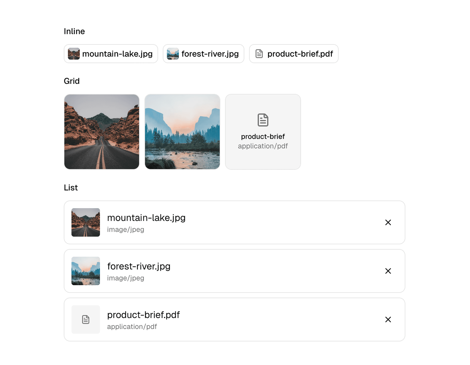
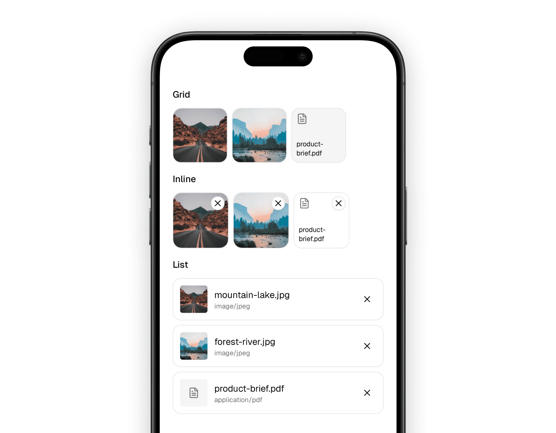
The attachment family exposes the same three layout variants on both platforms. Each one is useful in a different part of the product.
| Variant | Best fit | Notes |
|---|---|---|
grid | Message bubbles, gallery-like surfaces | Great for image-first attachments and compact previews |
inline | Prompt composers and compact rows | Keeps attachments small and easy to remove or inspect |
list | Document-heavy or mixed media views | Better when filename and media type matter more than the thumbnail |
That shared variant model is what makes the component easy to reuse. The same attachment data can be rendered differently depending on where it appears in the product.
Blocks
The API is intentionally simple. Most implementations only need a container, an item, and a preview, then optionally add metadata or removal behavior.
| Component | Role |
|---|---|
Attachments | Container that applies the selected variant layout |
Attachment | Individual attachment item with contextual styling |
AttachmentPreview | Thumbnail or icon preview based on media type |
AttachmentInfo | Label and optional media type display |
AttachmentRemove | Remove button for editable attachment lists |
AttachmentEmpty | Empty state surface |
On web, the family also includes AttachmentHoverCard, AttachmentHoverCardTrigger, and AttachmentHoverCardContent for richer preview-on-hover behavior.
Usage
The most common pattern is an Attachments container wrapping one or more Attachment items. From there, you decide whether the surface should be visual-first, compact, or metadata-heavy.
The web version is a good fit when you want richer preview behavior and more flexible composition around each item.
import {
  Attachment,
  AttachmentInfo,
  AttachmentPreview,
  AttachmentRemove,
  Attachments,
} from "@workspace/ui-web/ai-elements/attachments";
import type { AttachmentData } from "@workspace/ui-web/ai-elements/attachments";

const files = [
  {
    id: "img-1",
    type: "file" as const,
    url: "https://images.unsplash.com/photo-1500530855697-b586d89ba3ee?auto=format&fit=crop&w=800&q=80",
    mediaType: "image/jpeg",
    filename: "mountain-lake.jpg",
  },
  {
    id: "doc-1",
    type: "file" as const,
    url: "https://example.com/product-brief.pdf",
    mediaType: "application/pdf",
    filename: "product-brief.pdf",
  },
] satisfies AttachmentData[];

export function AttachmentRow() {
  return (
    <Attachments variant="inline">
      {files.map((file) => (
        <Attachment key={file.id} data={file} onRemove={() => undefined}>
          <div className="relative size-5 shrink-0">
            <div className="absolute inset-0 transition-opacity group-hover:opacity-0">
              <AttachmentPreview />
            </div>
            <AttachmentRemove className="absolute inset-0" />
          </div>
          <AttachmentInfo />
        </Attachment>
      ))}
    </Attachments>
  );
}
The mobile version follows the same structure, but the container is scroll-based and the interaction model is tuned for touch and native image rendering.
import {
  Attachment,
  AttachmentInfo,
  AttachmentPreview,
  AttachmentRemove,
  Attachments,
} from "@workspace/ui-mobile/ai-elements/attachments";
import type { AttachmentData } from "@workspace/ui-mobile/ai-elements/attachments";

const files = [
  {
    id: "img-1",
    type: "file" as const,
    url: "https://images.unsplash.com/photo-1500530855697-b586d89ba3ee?auto=format&fit=crop&w=800&q=80",
    mediaType: "image/jpeg",
    filename: "mountain-lake.jpg",
  },
  {
    id: "doc-1",
    type: "file" as const,
    url: "https://example.com/product-brief.pdf",
    mediaType: "application/pdf",
    filename: "product-brief.pdf",
  },
] satisfies AttachmentData[];

export function AttachmentRow() {
  return (
    <Attachments variant="list">
      {files.map((file) => (
        <Attachment key={file.id} data={file} onRemove={() => undefined}>
          <AttachmentPreview />
          <AttachmentInfo showMediaType />
          <AttachmentRemove />
        </Attachment>
      ))}
    </Attachments>
  );
}
Media handling
The preview component decides what to render based on the attachment data, so you do not need different components for every file type.
| Media type | Preview behavior |
|---|---|
| Images | Thumbnail preview |
| Video | Video-style media preview |
| Audio | Audio icon |
| Documents | File icon plus filename where space allows |
| Unknown files | Generic attachment icon |
That keeps the calling code simple. You pass data, and the preview layer decides whether the result should look visual or icon-based.
Platform differences
The shared design language is consistent, but the two implementations still respect the platform they live on.
| Area | Web | Mobile |
|---|---|---|
| Container | div-based layout | ScrollView-based layout |
| Rich preview | Hover-card helpers available | Native touch flow instead of hover |
| Image rendering | Standard img / video elements | expo-image |
| Inline editing feel | Great for composer chips and hover details | Great for touch removal and compact rows |
The result is a component family that feels shared, but not forced to behave identically across platforms.
In the starter
Attachments are used in two main ways throughout the AI starter: as editable items inside prompt composers, and as rendered assets inside messages or conversation history.
That split explains the API shape. AttachmentRemove and compact inline layouts matter more in composers, while grid and list variants matter more in messages and history views.
Related components
Attachments rarely appear on their own. These pages are the most relevant companions in the docs set.
How is this guide?
Last updated on