For the complete documentation index, see llms.txt. Prefer markdown by appending.mdto documentation URLs or sendingAccept: text/markdown.
<Message />
Message primitives for user and assistant turns, rich content, and layout. The foundation of conversation UI in TurboStarter AI.
<Message /> is the foundation of the conversation UI in the AI starter. It is not only a message bubble, but a small family of components for laying out user and assistant messages, rendering rich responses, attaching actions, and handling response branches.
Web
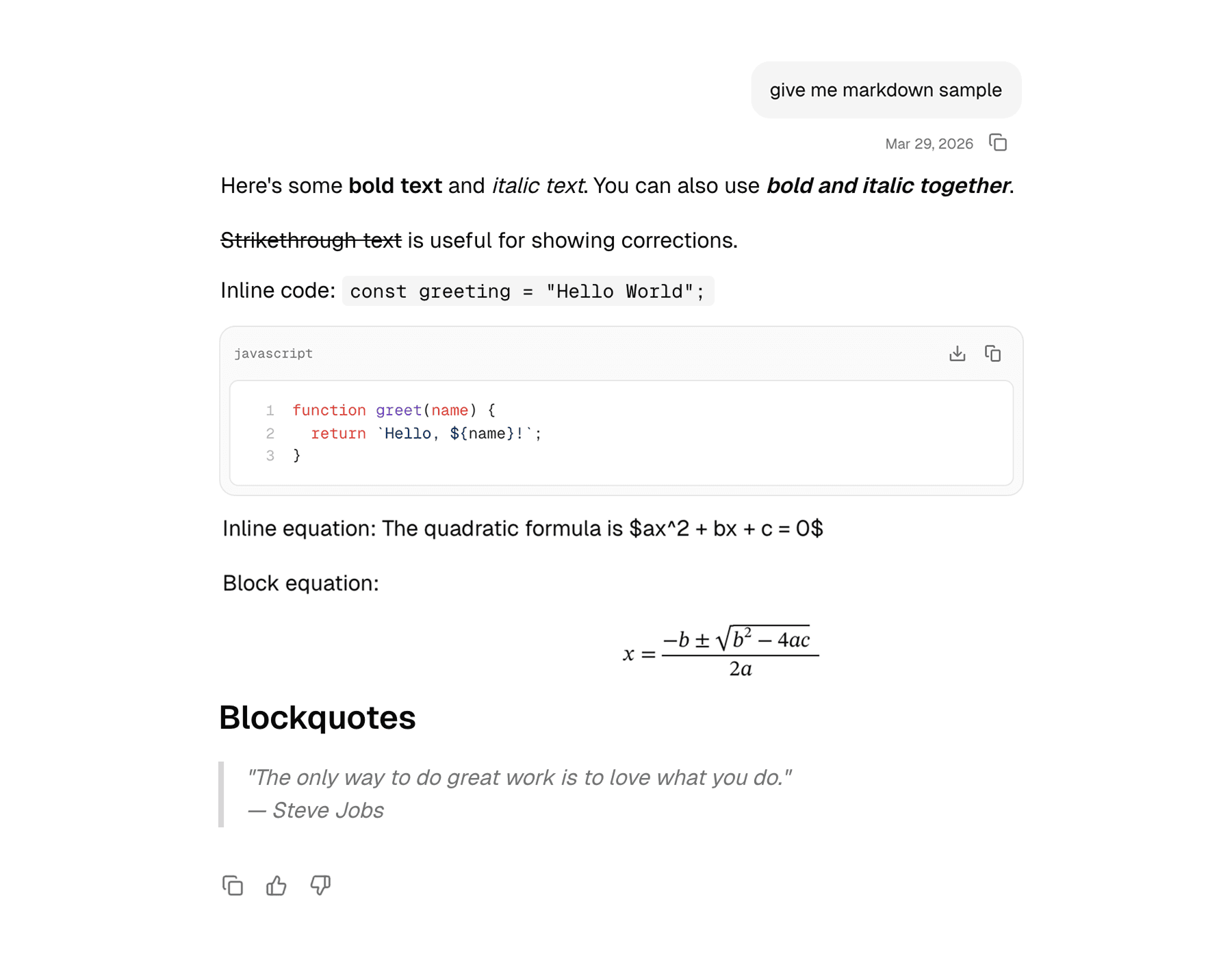
The web version is the more feature-rich implementation. It supports user-versus-assistant layout treatment, hover-revealed actions, rich markdown rendering through Streamdown, and a compact branch selector for alternate responses.
Mobile
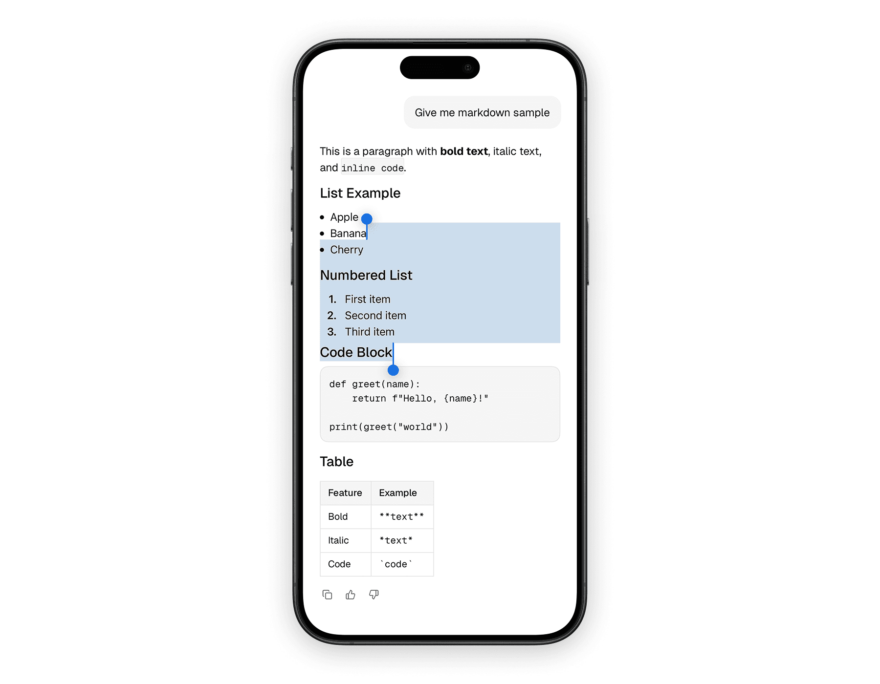
The mobile version keeps the same overall structure, but adapts it to a native layout with touch-friendly spacing and a lighter response renderer. It still supports actions and branch navigation, but without the hover-based affordances from the web version.
Blocks
The message system is intentionally composable. Most conversation UIs only need a few of these pieces, but the family gives you room to build from a simple bubble up to a more advanced assistant surface.
| Component | Role |
|---|---|
Message | Root wrapper that sets role-aware layout |
MessageContent | Main visual body of the message |
MessageActions | Action row below or beside the message |
MessageAction | Reusable action button primitive |
MessageResponse | Rich response renderer for assistant output |
MessageBranch* | Components for alternate response navigation |
The most important idea is that the root Message sets the role context, and the rest of the family adapts to that context rather than requiring you to pass the same role props over and over again.
Usage
The common pattern is a role-aware root message, a content section, and then optional actions. Assistant messages usually include MessageResponse, while user messages often render plain text or attachments inside MessageContent.
The web version works especially well when assistant output includes formatted markdown, code, math, or diagrams. The most relevant props are the from role on Message, regular layout props on MessageContent, button props on MessageAction, and Streamdown props on MessageResponse.
import {
  Message,
  MessageAction,
  MessageActions,
  MessageContent,
  MessageResponse,
} from "@workspace/ui-web/ai-elements/message";
import { Icons } from "@workspace/ui-web/icons";

export function AssistantMessage() {
  return (
    <Message from="assistant">
      <MessageContent>
        <MessageResponse>
          {
            "## Plan\n\nHere is a concise answer with **formatting** and `code`."
          }
        </MessageResponse>
      </MessageContent>

      <MessageActions>
        <MessageAction tooltip="Copy response">
          <Icons.Copy className="size-4" />
        </MessageAction>
      </MessageActions>
    </Message>
  );
}
The mobile version keeps the same composition pattern, but the response renderer is based on the native markdown component and actions are always touch-first. The key props are still from on Message, view props on the layout pieces, and button props on MessageAction.
import {
  Message,
  MessageAction,
  MessageActions,
  MessageContent,
  MessageResponse,
} from "@workspace/ui-mobile/ai-elements/message";
import { Icons } from "@workspace/ui-mobile/icons";

export function AssistantMessage() {
  return (
    <Message from="assistant">
      <MessageContent>
        <MessageResponse>
          {
            "## Plan\n\nHere is a concise answer with **formatting** and `code`."
          }
        </MessageResponse>
      </MessageContent>

      <MessageActions>
        <MessageAction label="Copy response">
          <Icons.Copy size={16} />
        </MessageAction>
      </MessageActions>
    </Message>
  );
}
Assistant and user roles
The message family changes its layout depending on the role. That makes user and assistant messages feel related, but not identical.
| Role | Treatment |
|---|---|
| User | Right-aligned, bubble-like surface |
| Assistant | Left-aligned, more open content layout |
That difference is subtle, but important. It lets rich assistant output breathe while still making user messages feel compact and clearly authored.
Response rendering
MessageResponse is one of the most useful pieces in the assistant side of the message family. It gives rich text output a dedicated renderer instead of pushing raw markdown handling into the surrounding conversation code.
| Platform | Renderer | Notes |
|---|---|---|
| Web | Streamdown | Supports richer formatting, including code, math, mermaid, and CJK plugins |
| Mobile | react-native-enriched-markdown | Better suited to compact native rendering and scrolling |
This is one of the reasons the message family is more than layout. It also standardizes how assistant output is actually presented.
Message branches
Both platforms support a branch-navigation model for alternate assistant responses. That is useful when the product allows regeneration or multiple candidate answers.
| Component | Purpose |
|---|---|
MessageBranch | Holds branch state |
MessageBranchContent | Renders the active branch |
MessageBranchSelector | Wraps the navigation controls |
MessageBranchPrevious / MessageBranchNext | Move between branches |
MessageBranchPage | Shows the current branch index |
The branch API is intentionally separate from the base Message so you only pay for that complexity when the product actually needs it.
Platform differences
The structure is shared, but the behavior still respects the platform.
| Area | Web | Mobile |
|---|---|---|
| Action visibility | Hover and focus reveal | Touch-first, always available in layout |
| Response rendering | Streamdown | Native markdown component |
| Root layout | div-based with role-specific utility classes | Animated.View with native layout transitions |
| Branch selector feel | Compact desktop control group | Native button row |
That balance keeps the component family consistent without making either platform feel awkwardly ported.
In the starter
The message family is where many of the other AI UI components come together. Attachments, tools, reasoning traces, context displays, and feedback actions often live inside or around a message.
That is why this page matters. If PromptInput starts the interaction, Message is where the result actually becomes visible to the user.
Related components
The message surface is usually composed with several other AI primitives. These are the most relevant companion pages in the docs set.
How is this guide?
Last updated on