For the complete documentation index, see llms.txt. Prefer markdown by appending.mdto documentation URLs or sendingAccept: text/markdown.
<Tool />
Tool component renders tool calls as readable UI instead of raw JSON. Show what ran, current state, and results in the thread.
<Tool /> turns a tool call into something users can actually read. Instead of exposing raw tool events or JSON blobs in the message flow, it gives you a structured surface for showing what ran, what state it is in, and what came back.
Web
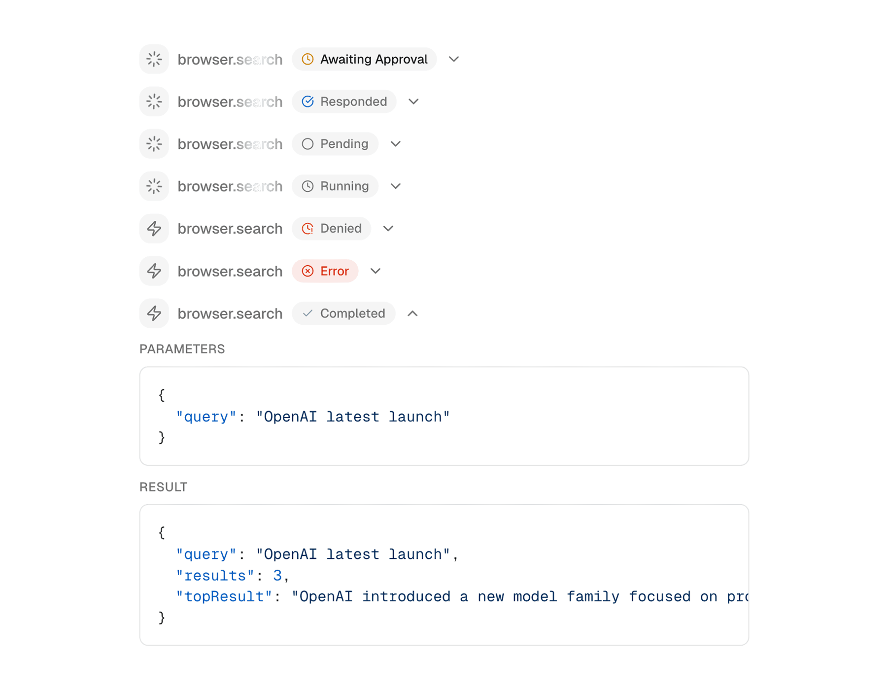
The web version is built around a collapsible row that feels native inside a desktop conversation. It is especially good for agentic chat UIs where tool activity should be visible but not overwhelming.
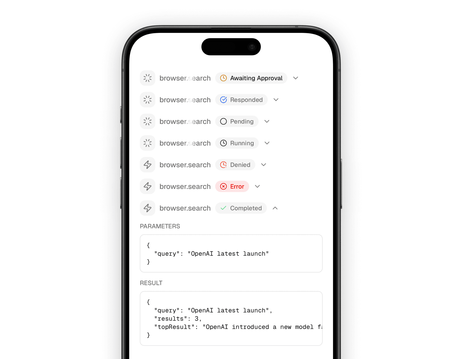
Mobile
The mobile version keeps the same mental model, but adapts the spacing and content rendering to a native layout. It still behaves like a compact activity row first, with details available when expanded.
What it communicates
This component is useful because tool calls are rarely just “done” or “not done.” They move through approval, execution, success, denial, or error states, and the UI needs to make that progression feel understandable.
Gives tool calls a proper status surface
Users can tell whether a tool is pending, running, completed, denied, or failed without reading raw event payloads.
Keeps details out of the main message flow
Inputs and outputs can stay tucked away until the user wants to inspect them.
Works well for agentic products
It fits naturally into assistant interfaces where tool calls are part of the conversation, not a separate debug panel.
Building blocks
<Tool /> is a compact compound component. The outer wrapper manages the collapsible state, and the inner pieces let you decide how much of the tool call to show.
The main exports are:
<Tool /><ToolHeader /><ToolContent /><ToolInput /><ToolOutput /><StatusBadge />
Basic composition
The standard pattern is a collapsed header row for the tool call plus expandable details for the input and output. The API shape stays close across platforms, which makes it easy to keep the same mental model in both apps.
import {
  Tool,
  ToolContent,
  ToolHeader,
  ToolInput,
  ToolOutput,
} from "@workspace/ui-web/ai-elements/tool";

export function WeatherTool() {
  return (
    <Tool>
      <ToolHeader type="tool-weather" state="input-available" />
      <ToolContent>
        <ToolInput input={{ city: "Warsaw", unit: "celsius" }} />
        <ToolOutput
          output={{ temperature: 18, condition: "Cloudy" }}
          errorText={undefined}
        />
      </ToolContent>
    </Tool>
  );
}
import {
Tool,
ToolContent,
ToolHeader,
ToolInput,
ToolOutput,
} from "@workspace/ui-mobile/ai-elements/tool";
export function WeatherTool() {
return (
<Tool>
<ToolHeader type="tool-weather" state="input-available" />
<ToolContent>
<ToolInput input={{ city: "Warsaw", unit: "celsius" }} />
<ToolOutput
output={{ temperature: 18, condition: "Cloudy" }}
errorText={undefined}
/>
</ToolContent>
</Tool>
);
}Supported states
The component family is designed around tool lifecycle states rather than around a single “loading” flag. That is why it reads much better in agent-driven UIs than a plain spinner row.
| State | Meaning |
|---|---|
approval-requested | The tool is waiting for explicit approval before it can run. |
approval-responded | An approval decision was made and the tool can proceed or stop accordingly. |
input-available | The tool input is ready and execution is underway. |
input-streaming | Input or tool activity is still streaming in. |
output-available | The tool completed successfully and produced a result. |
output-denied | The tool run was denied or blocked. |
output-error | The tool failed and returned an error state. |
How the pieces behave
A lot of the value in this component comes from the defaults baked into each part. You get a fairly rich tool row without having to author every little detail yourself.
<ToolHeader />derives a readable tool name from thetypewhen you do not pass a customtitle.- Non-final states use
<ShimmerText />to make the label feel active. - Final states switch to a static label and a status badge.
<ToolInput />renders structured input as JSON.<ToolOutput />can render JSON, strings, React elements, or an error panel.
That balance is what makes the component useful in both product UI and internal agent tooling.
Platform notes
The web and mobile versions stay aligned conceptually, but the rendering details are slightly different.
| Area | Web | Mobile |
|---|---|---|
| Base shell | DOM collapsible row | native collapsible row |
| Input/output rendering | code-block style surface | native scrollable JSON block |
| Status text | web text + shimmer primitives | native text + shimmer primitives |
| Layout feel | tighter desktop density | more touch-friendly spacing |
Related components
<Tool /> works best alongside the other conversation-level primitives that explain what the assistant is doing. These are the nearest companion pages in the current docs set.
How is this guide?
Last updated on