For the complete documentation index, see llms.txt. Prefer markdown by appending.mdto documentation URLs or sendingAccept: text/markdown.
<VoiceVisualizer />
Voice visualizer components for web and mobile voice sessions. Multiple styles that react to audio activity during live calls.
TurboStarter AI ships with a small family of voice visualizers rather than one fixed component. On web, the voice experience can render six different styles from packages/ui/web, while mobile uses a focused bar visualizer from packages/ui/mobile.
Web
The web side is the more flexible implementation. It includes six distinct visualizers, and the app-level voice screen selects between them based on the current visualizer settings.
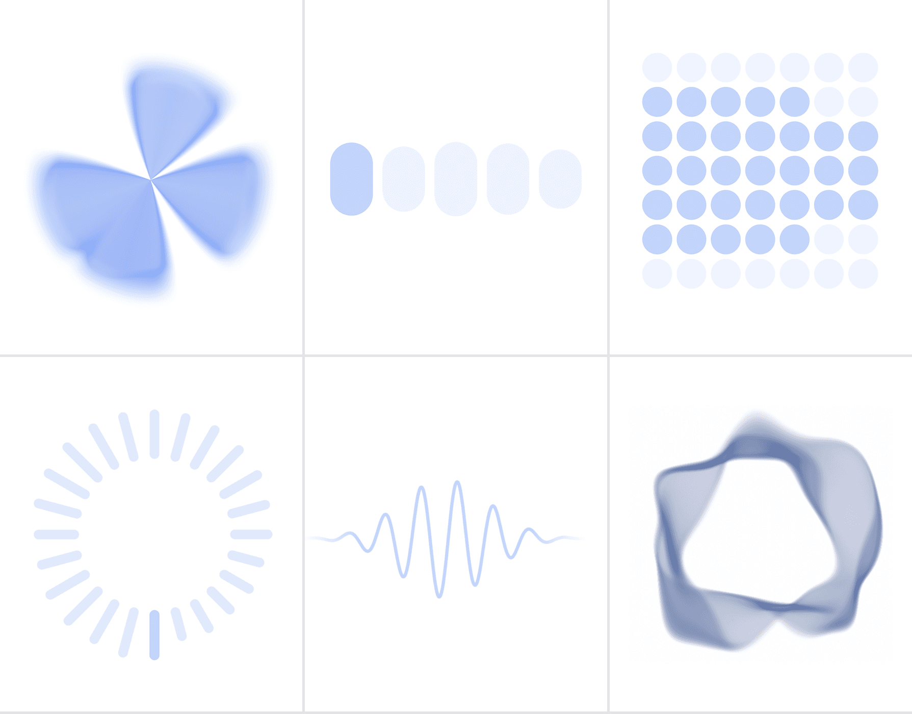
The web package includes six visualizer styles. They all react to voice-session but each one gives the interface a different character.
| Visualizer | Component | Best fit | Notes |
|---|---|---|---|
| Orb | Orb | Hero-style voice sessions | A shader-driven focal point with blended colors and volume-driven motion. |
| Bar | AudioVisualizerBar | Clear, familiar voice UI | The most direct option when you want a classic speech-bar treatment. |
| Grid | AudioVisualizerGrid | Structured layouts | Animates a matrix of cells and works well in more system-like interfaces. |
| Radial | AudioVisualizerRadial | Circular layouts | Wraps bars around a center point for a more ambient feel. |
| Wave | AudioVisualizerWave | Minimal wide layouts | Uses a shader-based waveform that feels clean and elegant. |
| Aura | AudioVisualizerAura | Premium, immersive surfaces | Renders a soft glowing field that feels more atmospheric than literal. |
In the app, the selected visualizer shape is read from the voice settings store and mapped to the matching primitive from @workspace/ui-web/voice/*.
Mobile
The mobile implementation is intentionally simpler. Instead of exposing a full visualizer family, it uses a single bar visualizer that stays clear and readable on a smaller screen.
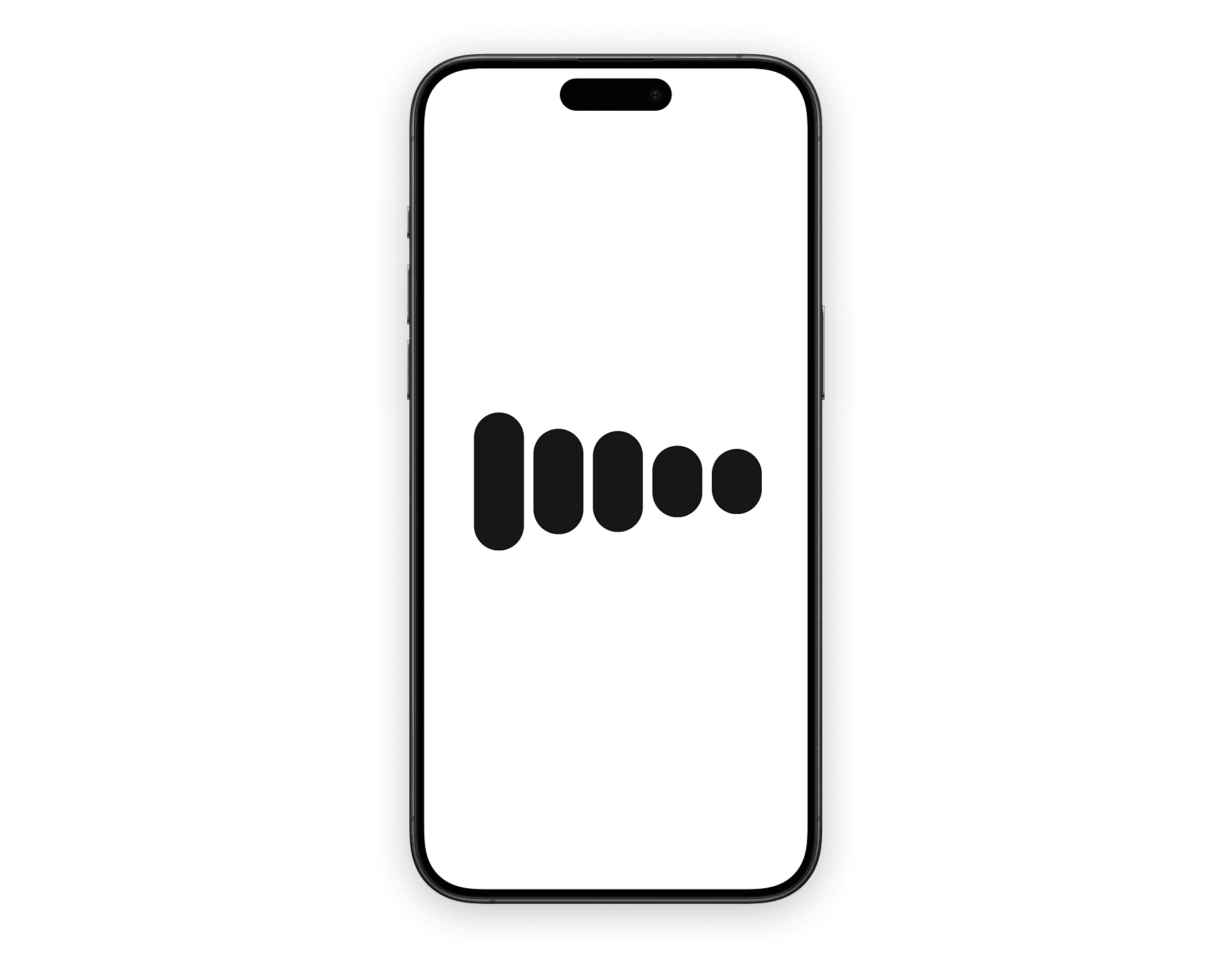
The mobile package currently exposes one voice visualizer primitive, and the app-level mobile voice screen follows that same direction.
| Visualizer | Component | Best fit | Notes |
|---|---|---|---|
| Bar | AudioVisualizerBar | Native full-screen voice sessions | A five-bar layout with animated idle and speaking states, optimized for compact mobile UI. |
That keeps the mobile experience consistent and easy to place next to transcript, controls, and the rest of the session UI.
What it brings to the session
A good voice interface needs more than controls and transcript text. The visualizer is what makes the session feel active before the next response is read or heard.
Makes state visible
Listening, thinking, and speaking each feel different, so the session never looks idle or frozen.
Adds polish without extra clutter
It creates a strong visual focal point without introducing more buttons, labels, or status chips.
Scales across platforms
The idea stays consistent between web and mobile, even though each platform renders it differently.
Usage
If you are building a custom voice surface, it is often better to use the primitives directly instead of relying on the app-level wrapper. Each example below stays minimal, but it uses the available props so you can see how the visualizer is meant to be configured.
The orb is the most configurable visualizer in the set. It works best when the visualizer is the centerpiece of the screen rather than a supporting detail.
import { Orb } from "@workspace/ui-web/voice/orb";
import { useRef } from "react";

export function OrbVisualizer() {
  const colorsRef = useRef<["#93c5fd", "#1d4ed8"]>(["#93c5fd", "#1d4ed8"]);
  const inputVolumeRef = useRef(0.2);
  const outputVolumeRef = useRef(0.45);

  return (
    <Orb
      colors={["#93c5fd", "#1d4ed8"]}
      colorsRef={colorsRef}
      resizeDebounce={0}
      seed={7}
      agentState="thinking"
      volumeMode="manual"
      manualInput={0.2}
      manualOutput={0.45}
      inputVolumeRef={inputVolumeRef}
      outputVolumeRef={outputVolumeRef}
      getInputVolume={() => 0.2}
      getOutputVolume={() => 0.45}
    />
  );
}| Prop | Purpose |
|---|---|
colors | Sets the base gradient pair. |
colorsRef | Updates colors dynamically without remounting. |
resizeDebounce | Controls how quickly the canvas reacts to resize changes. |
seed | Keeps the visual pattern deterministic. |
agentState | Drives the current animation state. |
volumeMode | Chooses automatic or manual volume control. |
manualInput / manualOutput | Pass explicit input and output levels. |
inputVolumeRef / outputVolumeRef | Provide refs for external live volume data. |
getInputVolume / getOutputVolume | Pull volume from callbacks instead of refs. |
The bar visualizer is the most straightforward option. It is usually the easiest one to drop into a product UI when you want something readable and familiar.
import { AudioVisualizerBar } from "@workspace/ui-web/voice/audio-visualizer-bar";
import { useVoiceAssistant } from "@livekit/components-react";

export function BarVisualizer() {
  const { audioTrack } = useVoiceAssistant();

  return (
    <AudioVisualizerBar
      size="lg"
      state="thinking"
      color="#2563eb"
      barCount={5}
      audioTrack={audioTrack}
    />
  );
}| Prop | Purpose |
|---|---|
size | Adjusts height and spacing. |
state | Changes the current animation pattern. |
color | Sets the bar color. |
barCount | Changes the number of bars. |
audioTrack | Connects speaking mode to live audio. |
The grid visualizer is better when you want a more structured or technical feel. It is also the easiest option to restyle because you can replace the default cell markup.
import { AudioVisualizerGrid } from "@workspace/ui-web/voice/audio-visualizer-grid";
import { useVoiceAssistant } from "@livekit/components-react";

export function GridVisualizer() {
  const { audioTrack } = useVoiceAssistant();

  return (
    <AudioVisualizerGrid
      size="lg"
      state="thinking"
      color="#2563eb"
      audioTrack={audioTrack}
      radius={3}
      interval={120}
      rowCount={7}
      columnCount={7}
    />
  );
}| Prop | Purpose |
|---|---|
size | Changes the gap scale. |
state | Controls the current animation state. |
color | Sets the active cell color. |
audioTrack | Connects the grid to live audio data. |
radius | Controls how far the highlight spreads. |
interval | Adjusts non-speaking animation timing. |
rowCount / columnCount | Define the grid dimensions. |
The radial visualizer is useful when the voice UI is built around a center point. It feels more ambient than bars while still staying readable.
import { AudioVisualizerRadial } from "@workspace/ui-web/voice/audio-visualizer-radial";
import { useVoiceAssistant } from "@livekit/components-react";

export function RadialVisualizer() {
  const { audioTrack } = useVoiceAssistant();

  return (
    <AudioVisualizerRadial
      size="lg"
      state="thinking"
      color="#2563eb"
      radius={72}
      barCount={24}
      audioTrack={audioTrack}
    />
  );
}| Prop | Purpose |
|---|---|
size | Changes the overall scale. |
state | Drives the current animation behavior. |
color | Sets the bar color. |
radius | Changes the distance from the center. |
barCount | Defines how many radial bars are rendered. |
audioTrack | Connects the visualizer to live audio. |
The wave visualizer is a strong default when you want something polished but understated. It works especially well in wider layouts and hero-like voice stages.
import { AudioVisualizerWave } from "@workspace/ui-web/voice/audio-visualizer-wave";
import { useVoiceAssistant } from "@livekit/components-react";

export function WaveVisualizer() {
  const { audioTrack } = useVoiceAssistant();

  return (
    <AudioVisualizerWave
      size="lg"
      state="thinking"
      color="#2563eb"
      colorShift={0.12}
      lineWidth={3}
      blur={2}
      audioTrack={audioTrack}
    />
  );
}| Prop | Purpose |
|---|---|
size | Changes the default height scale. |
state | Drives the motion profile. |
color | Sets the wave color. |
colorShift | Adds hue variation toward the edges. |
lineWidth | Changes the visible stroke thickness. |
blur | Softens the wave edge. |
audioTrack | Connects the wave to live audio. |
The aura visualizer is the softest option in the set. It is a good fit when you want the session to feel atmospheric rather than explicitly meter-driven.
import { AudioVisualizerAura } from "@workspace/ui-web/voice/audio-visualizer-aura";
import { useVoiceAssistant } from "@livekit/components-react";

export function AuraVisualizer() {
  const { audioTrack } = useVoiceAssistant();

  return (
    <AudioVisualizerAura
      size="lg"
      state="thinking"
      color="#2563eb"
      colorShift={0.18}
      themeMode="light"
      audioTrack={audioTrack}
    />
  );
}| Prop | Purpose |
|---|---|
size | Changes the visual scale. |
state | Drives the animation state. |
color | Sets the base aura color. |
colorShift | Adds variation across the effect. |
themeMode | Tunes the effect for light or dark backgrounds. |
audioTrack | Connects speaking mode to live audio. |
The mobile bar visualizer keeps the API compact, but the options object still gives you room to tune the motion and visual balance.
import { AudioVisualizerBar } from "@workspace/ui-mobile/voice/audio-visualizer-bar";
import { useVoiceAssistant } from "@livekit/components-react";

export function MobileVisualizer() {
  const { audioTrack } = useVoiceAssistant();

  return (
    <AudioVisualizerBar
      state="thinking"
      barCount={5}
      audioTrack={audioTrack}
      options={{
        maxHeight: 1,
        minHeight: 0.24,
        speakingCurve: 0.65,
        speakingGain: 1.35,
        idleHeights: [0.24, 0.36, 0.6, 0.36, 0.24],
        barColor: "#2563eb",
        barWidth: 44,
        barBorderRadius: 999,
        barGap: 10,
        activeOpacity: 1,
        inactiveOpacity: 0.2,
      }}
    />
  );
}| Prop | Purpose |
|---|---|
state | Drives the current animation state. |
barCount | Sets how many bars are rendered. |
trackRef | Connects the visualizer to live audio. |
options | Controls bar size, spacing, color, opacity, and idle or speaking behavior. |
Under the hood
Although the public API is intentionally small, the visualizer system is doing real session work for you. It ties motion to actual voice state instead of treating animation as decoration.
- On web, the wrapper chooses a visualizer style from the active voice settings and adapts it to the current theme, session and live input and output volume.
- On mobile, the implementation stays closer to a single native pattern and focuses on keeping the visualization readable and stable in a compact layout.
- Both versions react to the assistant lifecycle, so connecting, listening, thinking, and speaking can each look distinct.
Related components
<VoiceVisualizer /> usually lives at the center of a broader voice session. These pages are the most useful companions when you are building out the rest of that surface.
How is this guide?
Last updated on