For the complete documentation index, see llms.txt. Prefer markdown by appending.mdto documentation URLs or sendingAccept: text/markdown.
<PromptInput />
PromptInput family for chat, image, RAG, and voice entry points. Text input, attachments, and actions in one composable surface.
<PromptInput /> is the main text-entry surface across the AI starter. It is not just a single input field, but a small component family for building chat, image, RAG, and TTS composers with the same design language.
Web
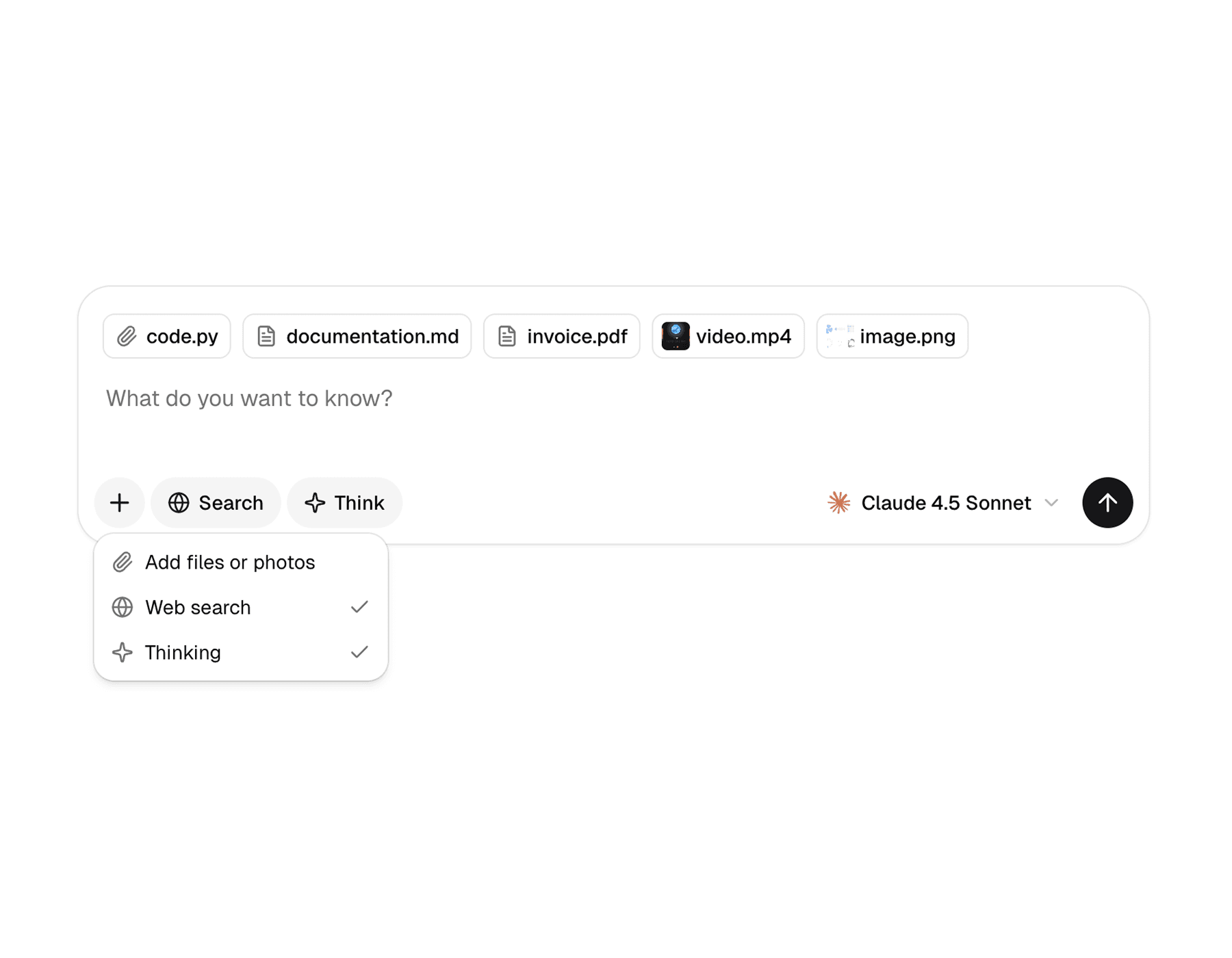
The web version is the broader implementation. It supports provider-driven state, drag and drop, attachment actions, referenced sources, menus, selects, hover cards, and richer composition around the textarea.
Mobile
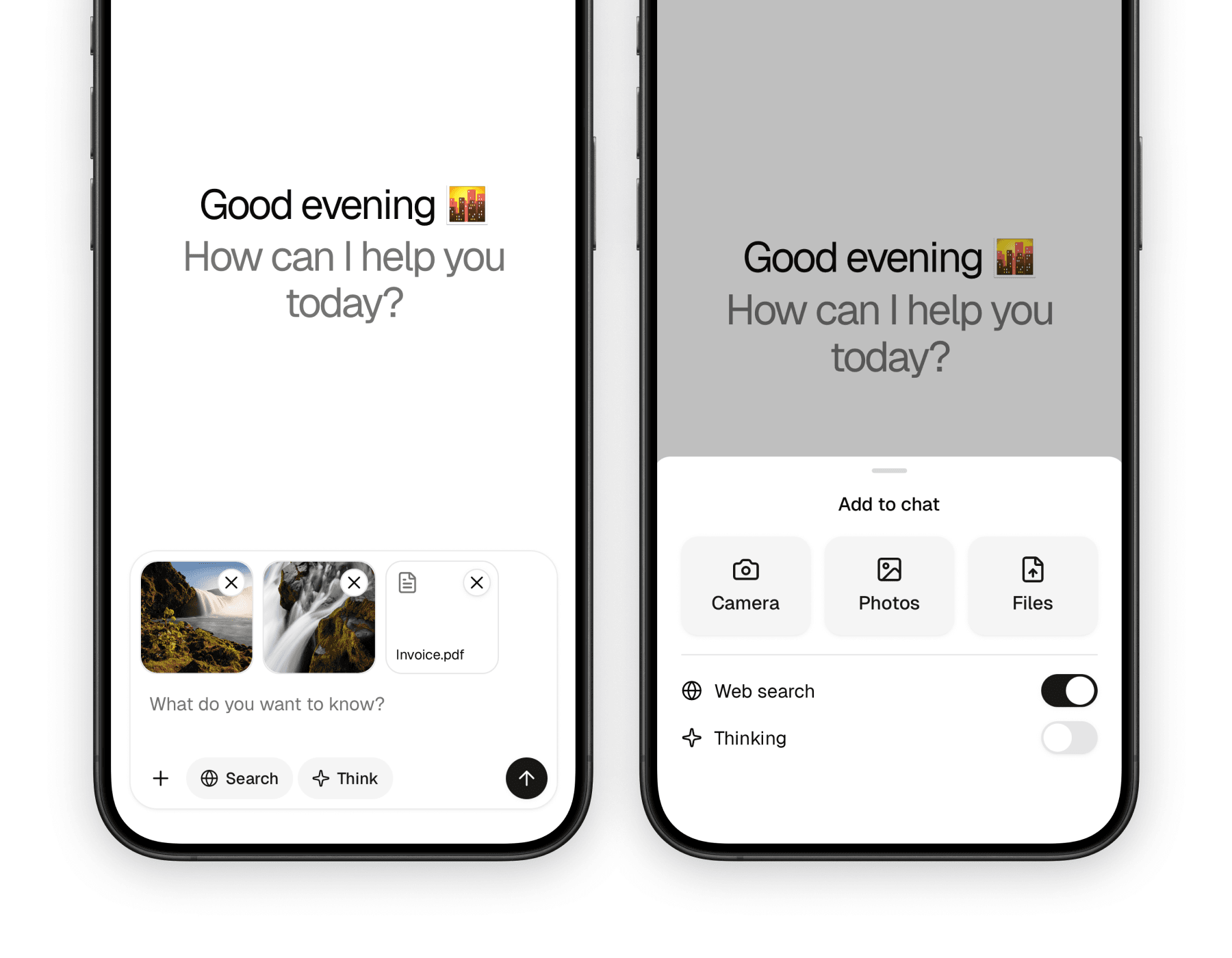
The mobile version keeps the same overall structure, but adapts it to native interaction patterns. Instead of drag and drop and hover-based UI, it leans on bottom sheets, touch-friendly buttons, and platform pickers for camera, photos, and files.
What makes it useful
Prompt input is where a lot of AI product complexity shows up. This component family gives that complexity a clean place to live without turning the composer into one giant custom component.
Composes well
You can start with a textarea and submit button, then add tools, model selectors, menus, attachments, and helper UI as needed.
Works across multiple apps
The same family is used for chat, image generation, knowledge RAG, and text-to-speech flows in the starter.
Handles real AI-input needs
Attachments, generation state, stop actions, and external input control are all first-class parts of the API.
Blocks
The component family is intentionally broad, but most implementations only need a handful of pieces. The root container handles submission flow, while the surrounding helpers shape the final composer UI.
| Component | Role |
|---|---|
PromptInput | Root container that owns submission flow and local state when no provider is used |
PromptInputProvider | Optional shared state provider for input text and attachments |
PromptInputTextarea | Main text entry area |
PromptInputSubmit | Send or stop button tied to generation state |
PromptInputHeader / PromptInputBody / PromptInputFooter | Layout regions for building the composer |
PromptInputTools / PromptInputButton | Tool rows and compact actions |
PromptInputActionMenu* | Attachment and secondary action menu primitives |
PromptInputSelect* | Model or option selectors placed inside the composer |
On web, the family also includes extras like PromptInputDropzone, PromptInputActionAddAttachments, PromptInputHoverCard*, PromptInputCommand*, and referenced source helpers.
Usage
The most common pattern is a root prompt input with a textarea and footer. From there, you can add tools and actions depending on the product surface.
The web version is best when the prompt input needs to behave like a full composer surface. The root component supports status, dropzone, attachments, onSubmit, and regular form props, while the child pieces shape the UI around it.
import {
  PromptInput,
  PromptInputFooter,
  PromptInputSubmit,
  PromptInputTextarea,
  PromptInputTools,
} from "@workspace/ui-web/ai-elements/prompt-input";
import type { PromptInputMessage } from "@workspace/ui-web/ai-elements/prompt-input";

export function ChatComposer() {
  return (
    <PromptInput
      status="ready"
      attachments={{
        maxFiles: 5,
        allowedMimeTypes: ["image/*", "application/pdf"],
      }}
      onSubmit={async (message: PromptInputMessage) => {
        console.log(message.text, message.files);
      }}
      className="w-full"
    >
      <PromptInputTextarea placeholder="Ask anything..." />

      <PromptInputFooter>
        <PromptInputTools />
        <PromptInputSubmit status="ready" />
      </PromptInputFooter>
    </PromptInput>
  );
}
The mobile version follows the same composition idea, but the root is a View-based container and the action flow is tuned for touch and native pickers. The key props are status, attachments, onSubmit, and standard view props.
import {
  PromptInput,
  PromptInputFooter,
  PromptInputSubmit,
  PromptInputTextarea,
  PromptInputTools,
} from "@workspace/ui-mobile/ai-elements/prompt-input";
import type { PromptInputMessage } from "@workspace/ui-mobile/ai-elements/prompt-input";

export function ChatComposer() {
  return (
    <PromptInput
      status="ready"
      attachments={{
        maxFiles: 5,
        allowedMimeTypes: ["image/*", "application/pdf"],
      }}
      onSubmit={async (message: PromptInputMessage) => {
        console.log(message.text, message.files);
      }}
    >
      <PromptInputTextarea placeholder="Ask anything..." />

      <PromptInputFooter>
        <PromptInputTools />
        <PromptInputSubmit status="ready" />
      </PromptInputFooter>
    </PromptInput>
  );
}
Shared state
If the composer needs to be controlled from outside the prompt input itself, both platforms expose a provider and controller hook. That is useful when examples, attachment previews, or external UI need to read or update the same state.
| Piece | Purpose |
|---|---|
PromptInputProvider | Lifts input and attachment state outside the root composer |
usePromptInputController() | Gives access to textInput and attachments |
usePromptInputAttachments() | Reads and manages current attachments |
On web, the provider also keeps track of the dropzone state so actions like “add attachments” can open the file dialog from elsewhere in the composer tree.
Attachments and actions
Attachments are a core part of the prompt input family, but the interaction model differs between web and mobile.
| Area | Web | Mobile |
|---|---|---|
| File input | Drag and drop plus file dialog | Native camera, photo library, and document pickers |
| Menu model | Dropdown-based action menu | Bottom-sheet action menu |
| Attachment helpers | PromptInputDropzone, PromptInputActionAddAttachments | PromptInputActionCamera, PromptInputActionPhotos, PromptInputActionFiles |
| Validation | PromptInputAttachmentsOptions for file count, size, and MIME checks | Same validation model, adapted to native assets |
That split is important: the API stays conceptually similar, but each platform uses the interaction pattern users already expect.
References
You do not need the entire component family every time. These are the parts most apps will end up using first.
| Need | Component |
|---|---|
| Main text field | PromptInputTextarea |
| Submit or stop button | PromptInputSubmit |
| Footer layout | PromptInputFooter |
| Inline tools row | PromptInputTools |
| Action menu trigger | PromptInputActionMenuTrigger |
| Model or option selector | PromptInputSelect* |
| Provider-controlled state | PromptInputProvider + usePromptInputController() |
On web, the command and hover-card primitives are also worth reaching for when the composer needs richer inline UX, such as search, slash commands, or contextual help.
In the starter
The prompt input is one of the most reused UI systems in the AI starter. It shows up in the Chat, Image, RAG, and TTS apps, with each surface composing a slightly different set of tools around the same foundation.
That reuse is the main reason the component family matters. Instead of rebuilding the composer for every app, the starter uses the same primitives and swaps in app-specific controls, selectors, and attachment behavior.
Related components
The prompt input usually sits next to other AI UI primitives rather than standing alone. These pages are the closest companions in the docs set.
How is this guide?
Last updated on