For the complete documentation index, see llms.txt. Prefer markdown by appending.mdto documentation URLs or sendingAccept: text/markdown.
<VoiceControlBar />
VoiceControlBar groups mute, end call, and session actions during voice chat. Core controls for an in-call voice experience.
<VoiceControlBar /> is the main interaction surface for the voice session once a user is connected. It brings the core voice actions into one place, so the session feels like a proper call experience rather than a scattered set of controls.
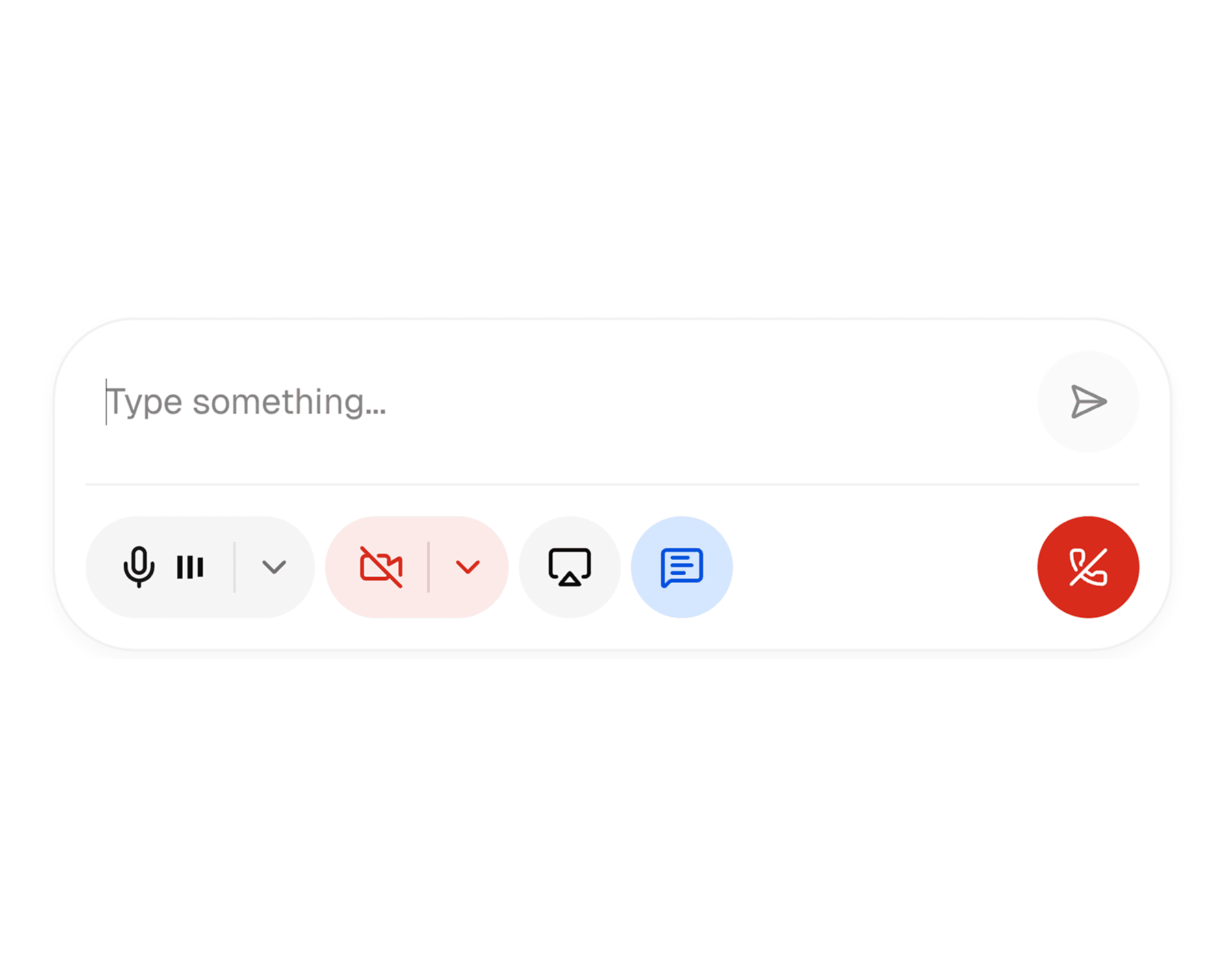
Web
The web control bar is the richer of the two implementations. It supports the main media toggles, disconnect flow, and an expandable inline chat composer for sending text into the live session.
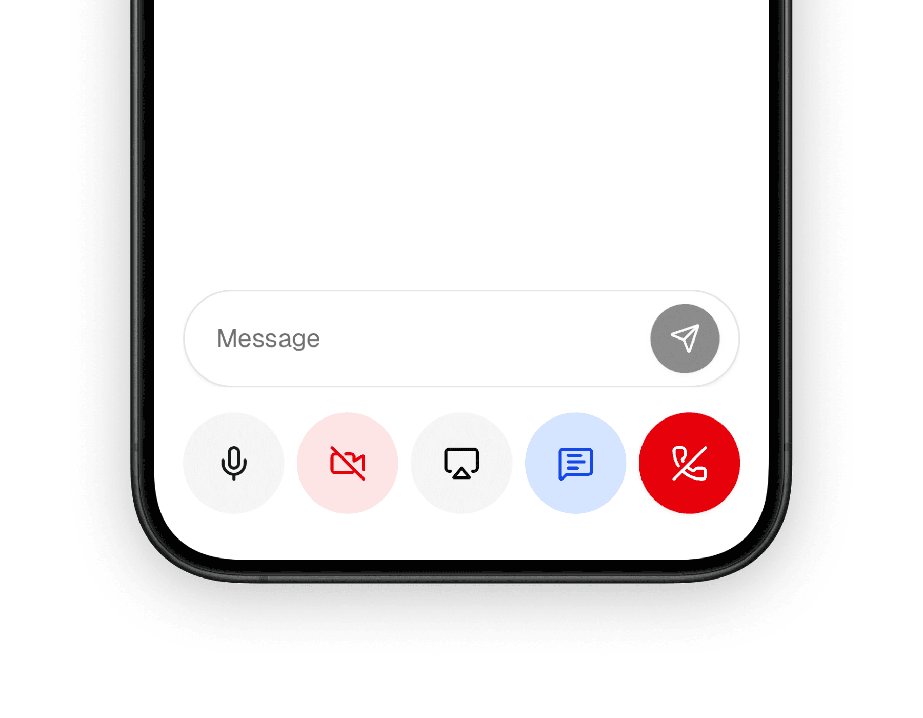
Mobile
The mobile control bar keeps the same control model, but presents it in a tighter native layout with larger touch targets and no inline text composer inside the bar itself.
What it does well
This component is useful because a voice product needs more than a mute button. Once the user is in a live session, the control surface has to coordinate media, chat, and exit actions in a way that stays readable under pressure.
Keeps session controls together
Microphone, camera, screen sharing, chat, and disconnect actions live in one predictable place.
Feels native to real-time voice UX
The control bar gives the session a call-like interaction pattern instead of a generic toolbar.
Scales from simple to full sessions
You can show only a few controls or enable the full bar depending on the product surface.
Core controls
Both implementations revolve around the same control categories, even though the internal composition differs by platform.
| Control | Purpose |
|---|---|
| Microphone | Mute or unmute the user's audio track |
| Camera | Enable or disable the local camera track |
| Screen share | Start or stop screen sharing when supported |
| Chat | Toggle an in-session chat surface |
| Leave | Disconnect from the active session |
On web, the chat control can expand into a compact inline input inside the control bar. On mobile, chat is still represented as a toggle, but the actual message entry happens in the surrounding session UI rather than inside the bar.
Basic usage
You usually render the control bar as part of a connected voice session, passing in which controls should be visible and wiring it to the session state around it.
import { ControlBar } from "@workspace/ui-web/voice/control-bar";

export function VoiceSessionControls() {
  return (
    <ControlBar
      isConnected
      controls={{
        microphone: true,
        camera: true,
        screenShare: true,
        chat: true,
        leave: true,
      }}
    />
  );
}
import { ControlBar } from "@workspace/ui-mobile/voice/control-bar";
export function VoiceSessionControls() {
return (
<ControlBar
controls={{
microphone: true,
camera: true,
screenShare: true,
chat: true,
leave: true,
}}
/>
);
}Platform differences
The interaction model is shared, but the two implementations are not identical. That is intentional, because a voice call bar should respect the platform it lives on.
| Area | Web | Mobile |
|---|---|---|
| Chat handling | Optional inline text input inside the control bar | toggle only, with chat handled elsewhere in the session UI |
| Device logic | More browser-specific media and device handling | simpler native voice-session control surface |
| Variants | default, outline, and livekit | default and outline |
| Layout feel | wider desktop toolbar | compact touch-friendly row |
Useful props
The control bar is mostly configured through visibility flags and a few session callbacks.
| Prop | Type | Notes |
|---|---|---|
controls | object | Chooses which controls are visible: leave, microphone, camera, screenShare, chat |
variant | string | Changes the visual treatment of the bar |
isChatOpen | boolean | Controls whether the chat state is open |
onIsChatOpenChange | function | Called when the chat toggle changes |
onDisconnect | function | Called when the user disconnects |
onDeviceError | function | Useful for reacting to media-device issues |
The web version also accepts more session-oriented props like isConnected and media-control helpers because it owns more of the interactive logic directly.
How it fits into the voice UI
This component works best when it is treated as the bottom control rail of a larger voice session. It is not the whole experience on its own; it is the part that keeps the user in control while the transcript, visualizer, and media tiles do the rest.
That means it pairs especially well with:
- a voice visualizer above it
- a transcript or chat panel nearby
- session state from LiveKit or a similar real-time layer
Related components
The voice control bar is part of a small family of voice UI primitives. These are the most relevant companion pages in this docs set.
How is this guide?
Last updated on