For the complete documentation index, see llms.txt. Prefer markdown by appending.mdto documentation URLs or sendingAccept: text/markdown.
<ModelSelector />
ModelSelector picker with web and mobile variants. Let users switch models without rebuilding selection UI from scratch.
<ModelSelector /> is the model picker used across the AI starter. It ships in two UI variants:
select: a compact dropdownmodal: a richer picker for larger model catalogs (search, providers, capabilities)
The modal variant is also a great fit when your model list is fetched dynamically. In the starter it’s wired to work with remote model catalogs, and you can plug it into providers like OpenRouter, models.dev, or an AI gateway.
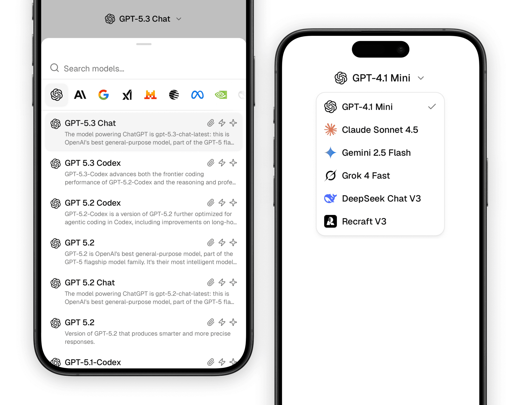
Web
On web you can use either the small select dropdown or the larger modal picker. The modal adapts to screen size: it renders as a popover on desktop and a drawer on smaller screens.
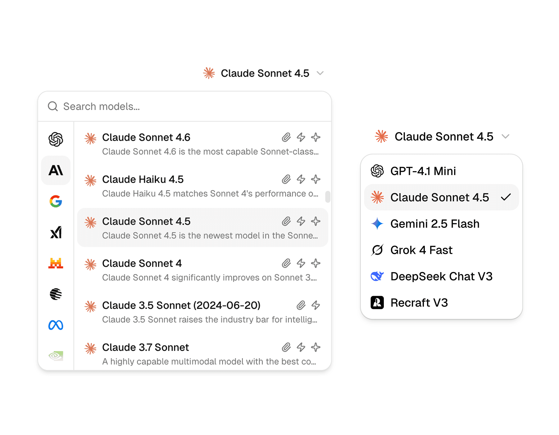
Mobile
On mobile, the select trigger includes the provider or model logo by default. The modal variant is built on a bottom sheet and works well for browsing a longer list.
Why it matters
Model choice is often one of the most important controls in an AI product, but it can also become visually messy very quickly. This component helps you present that choice in a way that feels intentional instead of improvised.
Designed for AI workflows
The component already understands provider logos, model names, and the kind of compact trigger most chat products need.
Reusable beyond the dropdown
The logo and name helpers are useful on their own in places like usage panels, model badges, and message metadata.
Consistent across surfaces
Whether the selector appears in a composer, a settings area, or a context panel, it keeps the visual language of model choice consistent.
Building blocks
<ModelSelector /> is a small family of parts rather than a single monolithic control. Most screens only need the trigger, the content, and the shared logo/name helpers.
The exports are grouped by variant:
select variant:
ModelSelectorSelectModelSelectorSelectTriggerModelSelectorSelectContentModelSelectorSelectItem
modal variant:
ModelSelectorModalModelSelectorModalTriggerModelSelectorModalContentModelSelectorModalList
Shared helpers:
ModelSelectorLogoModelSelectorNameModelSelectorDescriptionModelSelectorProvidersModelSelectorCapabilitiesModelSelectorSearchInput
Variants
Both variants solve “pick a model”, but the interaction feel is different.
| Variant | Best fit | Notes |
|---|---|---|
select | chat toolbars, compact settings | fast, minimal UI |
modal | long model lists, discovery | search + provider browsing; ideal for dynamic catalogs |
Select variant
The select variant is best when the model list is short and the picker should stay out of the way.
import {
  ModelSelectorSelect,
  ModelSelectorSelectContent,
  ModelSelectorSelectItem,
  ModelSelectorSelectTrigger,
} from "@workspace/ui-web/ai-elements/model-selector";

export function ChatModelSelector() {
  return (
    <ModelSelectorSelect value="gpt-4.1-mini">
      <ModelSelectorSelectTrigger />
      <ModelSelectorSelectContent>
        <ModelSelectorSelectItem value="gpt-4.1-mini">
          GPT-4.1 Mini
        </ModelSelectorSelectItem>
        <ModelSelectorSelectItem value="claude-4-sonnet">
          Claude 4 Sonnet
        </ModelSelectorSelectItem>
        <ModelSelectorSelectItem value="gemini-2.5-flash">
          Gemini 2.5 Flash
        </ModelSelectorSelectItem>
      </ModelSelectorSelectContent>
    </ModelSelectorSelect>
  );
}
import {
ModelSelectorSelect,
ModelSelectorSelectContent,
ModelSelectorSelectItem,
ModelSelectorSelectTrigger,
} from "@workspace/ui-mobile/ai-elements/model-selector";
export function ChatModelSelector() {
return (
<ModelSelectorSelect value="gpt-4.1-mini">
<ModelSelectorSelectTrigger provider="openai" model="gpt-4.1-mini" />
<ModelSelectorSelectContent>
<ModelSelectorSelectItem value="gpt-4.1-mini">
GPT-4.1 Mini
</ModelSelectorSelectItem>
<ModelSelectorSelectItem value="claude-4-sonnet">
Claude 4 Sonnet
</ModelSelectorSelectItem>
<ModelSelectorSelectItem value="gemini-2.5-flash">
Gemini 2.5 Flash
</ModelSelectorSelectItem>
</ModelSelectorSelectContent>
</ModelSelectorSelect>
);
}Modal variant
The modal variant is built for browsing. It’s the one you want when you have many models, when you want provider filtering, or when the list is fetched dynamically.
You can source models from anywhere: OpenRouter, models.dev, an AI gateway, or your own API. The picker only needs a normalized list to render.
import { useEffect, useMemo, useState } from "react";

import {
  ModelSelectorCapabilities,
  ModelSelectorDescription,
  ModelSelectorLogo,
  ModelSelectorModal,
  ModelSelectorModalContent,
  ModelSelectorModalList,
  ModelSelectorModalTrigger,
  ModelSelectorName,
  ModelSelectorProviders,
  ModelSelectorSearchInput,
} from "@workspace/ui-web/ai-elements/model-selector";

type ModelItem = {
  id: string;
  name: string;
  description?: string;
  provider: string;
  attachments: boolean;
  tools: boolean;
  reasoning: boolean;
};

export function ChatModelSelectorModal() {
  const [value, setValue] = useState("gpt-4.1-mini");
  const [provider, setProvider] = useState("openai");
  const [query, setQuery] = useState("");
  const [models, setModels] = useState<ModelItem[]>([]);

  useEffect(() => {
    // Fetch models dynamically (OpenRouter, models.dev, AI gateway, or your API).
    setModels([
      {
        id: "gpt-4.1-mini",
        name: "GPT-4.1 Mini",
        provider: "openai",
        description: "Fast, general-purpose model.",
        attachments: true,
        tools: true,
        reasoning: false,
      },
      {
        id: "claude-4-sonnet",
        name: "Claude 4 Sonnet",
        provider: "anthropic",
        description: "Strong writing and reasoning balance.",
        attachments: true,
        tools: true,
        reasoning: true,
      },
    ]);
  }, []);

  const providers = useMemo(
    () => Array.from(new Set(models.map((m) => m.provider))),
    [models],
  );

  const filtered = useMemo(() => {
    return models
      .filter((m) => (provider ? m.provider === provider : true))
      .filter((m) => m.name.toLowerCase().includes(query.toLowerCase()));
  }, [models, provider, query]);

  return (
    <ModelSelectorModal>
      <ModelSelectorModalTrigger>
        <ModelSelectorLogo provider={provider} model={value} />
        <ModelSelectorName>
          {models.find((m) => m.id === value)?.name ?? "Select a model"}
        </ModelSelectorName>
      </ModelSelectorModalTrigger>

      <ModelSelectorModalContent
        className="w-[min(44rem,calc(100vw-2rem))] p-0"
        popover={{ align: "end" }}
      >
        <div className="flex min-h-0 min-w-0 flex-col md:flex-row">
          <ModelSelectorProviders
            providers={providers}
            value={provider}
            onValueChange={setProvider}
            className="shrink-0"
          />

          <div className="flex min-h-0 min-w-0 flex-1 flex-col">
            <ModelSelectorSearchInput
              value={query}
              onChange={(e) => setQuery(e.currentTarget.value)}
              placeholder="Search models"
            />

            <ModelSelectorModalList className="h-[28rem]">
              <div className="flex flex-col gap-0.5">
                {filtered.map((m) => (
                  <button
                    key={m.id}
                    type="button"
                    role="option"
                    aria-selected={m.id === value}
                    className="hover:bg-accent flex min-w-0 items-start gap-3 rounded-lg px-3 py-2 text-left"
                    onClick={() => setValue(m.id)}
                  >
                    <ModelSelectorLogo provider={m.provider} model={m.id} />
                    <div className="min-w-0 flex-1">
                      <div className="flex min-w-0 items-center justify-between gap-3">
                        <ModelSelectorName>{m.name}</ModelSelectorName>
                        <ModelSelectorCapabilities
                          attachments={m.attachments}
                          tools={m.tools}
                          reasoning={m.reasoning}
                        />
                      </div>
                      {m.description && (
                        <ModelSelectorDescription>
                          {m.description}
                        </ModelSelectorDescription>
                      )}
                    </div>
                  </button>
                ))}
              </div>
            </ModelSelectorModalList>
          </div>
        </div>
      </ModelSelectorModalContent>
    </ModelSelectorModal>
  );
}
import { useMemo, useState } from "react";
import { View } from "react-native";
import {
ModelSelectorCapabilities,
ModelSelectorDescription,
ModelSelectorLogo,
ModelSelectorModal,
ModelSelectorModalContent,
ModelSelectorModalList,
ModelSelectorModalTrigger,
ModelSelectorName,
ModelSelectorProviders,
ModelSelectorSearchInput,
} from "@workspace/ui-mobile/ai-elements/model-selector";
import { Button } from "@workspace/ui-mobile/button";
import { Text } from "@workspace/ui-mobile/text";
type ModelItem = {
id: string;
name: string;
description?: string;
provider: string;
attachments: boolean;
tools: boolean;
reasoning: boolean;
};
const models: ModelItem[] = [
{
id: "gpt-4.1-mini",
name: "GPT-4.1 Mini",
provider: "openai",
description: "Fast, general-purpose model.",
attachments: true,
tools: true,
reasoning: false,
},
{
id: "claude-4-sonnet",
name: "Claude 4 Sonnet",
provider: "anthropic",
description: "Strong writing and reasoning balance.",
attachments: true,
tools: true,
reasoning: true,
},
];
export function ChatModelSelectorModal() {
const [value, setValue] = useState("gpt-4.1-mini");
const [provider, setProvider] = useState("openai");
const [query, setQuery] = useState("");
const providers = useMemo(
() => Array.from(new Set(models.map((m) => m.provider))),
[],
);
const filtered = useMemo(() => {
return models
.filter((m) => (provider ? m.provider === provider : true))
.filter((m) => m.name.toLowerCase().includes(query.toLowerCase()));
}, [provider, query]);
return (
<ModelSelectorModal>
<ModelSelectorModalTrigger>
<ModelSelectorLogo provider={provider} model={value} size={20} />
<ModelSelectorName>
{models.find((m) => m.id === value)?.name ?? "Select a model"}
</ModelSelectorName>
</ModelSelectorModalTrigger>
<ModelSelectorModalContent>
<Text className="px-4 pb-2 font-sans-medium">Models</Text>
<ModelSelectorSearchInput
value={query}
onChangeText={setQuery}
placeholder="Search models"
/>
<ModelSelectorProviders
providers={providers}
value={provider}
onValueChange={setProvider}
/>
<ModelSelectorModalList
data={filtered}
estimatedItemSize={64}
keyExtractor={(item) => item.id}
renderItem={({ item }) => (
<Button
variant="ghost"
className="flex-row items-start gap-3 rounded-xl p-3"
onPress={() => setValue(item.id)}
>
<ModelSelectorLogo
provider={item.provider}
model={item.id}
size={20}
/>
<View className="min-w-0 flex-1">
<View className="flex-row items-center justify-between gap-3">
<ModelSelectorName>{item.name}</ModelSelectorName>
<ModelSelectorCapabilities
attachments={item.attachments}
tools={item.tools}
reasoning={item.reasoning}
/>
</View>
{item.description && (
<ModelSelectorDescription>
{item.description}
</ModelSelectorDescription>
)}
</View>
</Button>
)}
/>
</ModelSelectorModalContent>
</ModelSelectorModal>
);
}Logo and name helpers
One of the most useful details in this component family is that the branding logic is reusable. You do not need to duplicate provider-logo matching in other parts of the interface.
import {
  ModelSelectorLogo,
  ModelSelectorName,
} from "@workspace/ui-web/ai-elements/model-selector";

export function ModelMeta() {
  return (
    <div className="flex items-center gap-2">
      <ModelSelectorLogo provider="anthropic" model="claude-4-sonnet" />
      <ModelSelectorName>Claude 4 Sonnet</ModelSelectorName>
    </div>
  );
}
import {
ModelSelectorLogo,
ModelSelectorName,
} from "@workspace/ui-mobile/ai-elements/model-selector";
export function ModelMeta() {
return (
<View className="flex-row items-center gap-2">
<ModelSelectorLogo provider="anthropic" model="claude-4-sonnet" />
<ModelSelectorName>Claude 4 Sonnet</ModelSelectorName>
</View>
);
}The helpers first try to match model-specific icons for names like claude, gemini, grok, or nano-banana. If no model-specific icon matches, they fall back to the provider icon, and then finally to an external logo from models.dev.
Platform differences
The two versions stay close in spirit, but there are a few differences worth knowing when you design around them.
| Area | Web | Mobile |
|---|---|---|
select trigger | Compact text-first trigger | Trigger includes logo by default |
| Logo fallback | img fallback from models.dev | expo-image fallback from models.dev |
| Name helper | span-based text helper | native Text-based helper |
modal surface | popover (desktop) / drawer (small screens) | bottom sheet |
| Visual feel | tighter desktop toolbar fit | easier scanning in touch layouts |
What to customize
Most customization happens through composition and styling rather than through a long prop list. In practice, the main knobs are:
- the variant you choose (
selectvsmodal) - the selected value and state wiring in your app
classNameon triggers and list rows- the
providerandmodelvalues used to resolve the right logo - wiring the modal list to a dynamic model catalog (OpenRouter, models.dev, AI gateway, or your API)
That makes the component easy to adapt without turning it into a configuration-heavy abstraction.
Related components
<ModelSelector /> tends to live near other model-aware pieces of the UI. These are the most natural companion pages in this docs set.
How is this guide?
Last updated on