For the complete documentation index, see llms.txt. Prefer markdown by appending.mdto documentation URLs or sendingAccept: text/markdown.
<Context />
Context component surfaces token usage and response cost. Help users understand how much context a reply consumed.
<Context /> is a small compound component for answering a question users increasingly care about in AI products: how much context has been used, and what did that response cost?
It turns raw token usage into a compact, inspectable UI that feels at home inside chat interfaces.
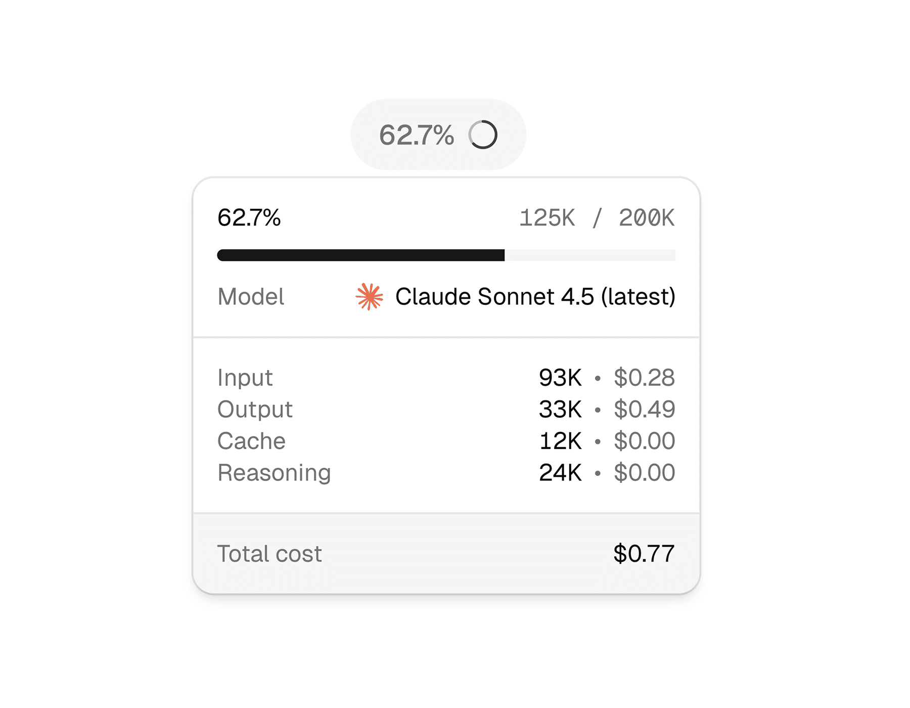
Web
On web, the context UI opens as a lightweight hover card and falls back to a popover on touch devices. That makes it easy to keep the interface compact while still exposing detailed token and cost information when the user asks for it.
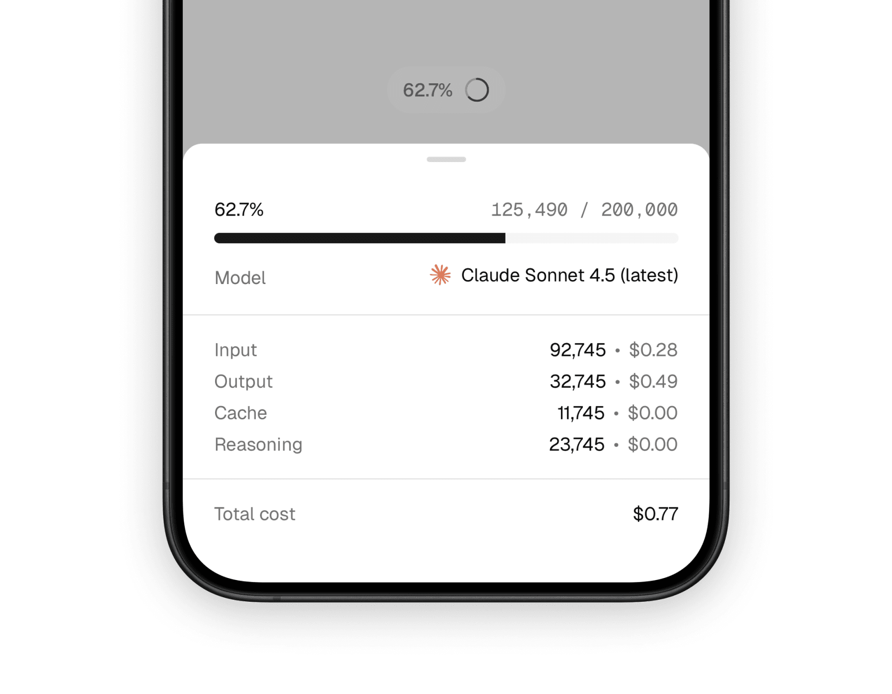
Mobile
On mobile, the same information is presented through a bottom sheet. That keeps the summary trigger small while giving the detail view enough room for token breakdowns, pricing, and model metadata on a narrow screen.
What it solves
This component is less about decoration and more about trust. It gives users a simple way to inspect usage details without forcing the main message UI to carry that information all the time.
Makes token usage visible
The trigger gives a quick usage signal, and the expanded view shows what is happening in more detail.
Connects model choice to cost
By combining model metadata with usage numbers, it helps users understand why one generation may be more expensive than another.
Fits conversation UIs well
It works especially well in assistants, playgrounds, and message rows where context usage matters but should not dominate the layout.
Compound API
Unlike a one-piece badge, <Context /> is designed as a small composition system. You wrap the data once, then arrange the trigger and content pieces however your interface needs them.
The main parts are:
<Context />for the shared model, provider, and usage data<ContextTrigger />for the compact entry point<ContextContent />for the expanded panel or sheet<ContextContentHeader />,<ContextContentBody />, and<ContextContentFooter />for structure<ContextInputUsage />,<ContextOutputUsage />,<ContextReasoningUsage />, and<ContextCacheUsage />for the token breakdown
Basic composition
The most common pattern is a small trigger that opens a richer detail panel. The implementation differs slightly by platform, but the mental model stays the same.
import {
  Context,
  ContextContent,
  ContextContentBody,
  ContextContentFooter,
  ContextContentHeader,
  ContextInputUsage,
  ContextOutputUsage,
  ContextTrigger,
} from "@workspace/ui-web/ai-elements/context";

export function MessageContext() {
  return (
    <Context
      model="claude-sonnet-4-5"
      provider="anthropic"
      usage={{ input: 1240, output: 382, reasoning: 240, cached: 240 }}
    >
      <ContextTrigger />
      <ContextContent>
        <ContextContentHeader />
        <ContextContentBody>
          <ContextInputUsage />
          <ContextOutputUsage />
          <ContextCacheUsage />
          <ContextReasoningUsage />
        </ContextContentBody>
        <ContextContentFooter />
      </ContextContent>
    </Context>
  );
}
import {
Context,
ContextContent,
ContextContentBody,
ContextContentFooter,
ContextContentHeader,
ContextInputUsage,
ContextOutputUsage,
ContextTrigger,
} from "@workspace/ui-mobile/ai-elements/context";
export function MessageContext() {
return (
<Context
model="claude-sonnet-4-5"
provider="anthropic"
usage={{ input: 1240, output: 382, reasoning: 240, cached: 240 }}
>
<ContextTrigger />
<ContextContent>
<ContextContentHeader />
<ContextContentBody>
<ContextInputUsage />
<ContextOutputUsage />
<ContextCacheUsage />
<ContextReasoningUsage />
</ContextContentBody>
<ContextContentFooter />
</ContextContent>
</Context>
);
}Shared inputs
At the top level, both versions take the same core data. That is what makes the component easy to reuse across different message and assistant surfaces.
| Prop | Type | Notes |
|---|---|---|
model | string | The model identifier used to look up limits and pricing metadata. |
provider | string | undefined | The provider identifier. If omitted, model lookup falls back to model-only resolution. |
usage | { input?: number; output?: number; reasoning?: number; cached?: number } | The token usage payload shown in the trigger and detail sections. |
The rest of the customization mostly comes from composition. You can replace or rearrange the trigger, header, body, footer, and usage rows instead of passing a long list of appearance props.
Platform-specific behavior
The platform distinction matters here because interaction design changes the feel of the component quite a bit, even when the data is identical.
- Web uses a hover-card style interaction and switches to a popover on touch devices.
- Mobile uses a bottom sheet, which gives the content more breathing room and feels natural in native layouts.
- Both versions fetch model metadata through tokenlens, calculate context usage, and render estimated costs from the same usage payload.
That shared logic helps the component stay consistent even though the surrounding shell is platform-native.
What the user sees
Most users will encounter this component in two stages: a small trigger first, then a detail surface only when they want more context. That balance keeps the main conversation readable while still exposing meaningful operational detail.
The default experience typically includes:
- a percentage-style trigger based on used context
- a circular usage icon
- the current model name and provider logo
- input, output, reasoning, and cache token rows when available
- an estimated total cost footer
Related components
<Context /> is most useful when paired with other message-level primitives. These are the closest companion pages in the component set.
<Message />
A natural place to attach context usage and model metadata in assistant conversations.
<ModelSelector />
Closely related because context usage becomes more meaningful when users can also change models.
<Reasoning />
Pairs well with context usage when you want to expose both model effort and token consumption.
How is this guide?
Last updated on